
Standard Fields can be used multiple times while building a form and give you the ability to provide actionable options to be chosen by your requesters.
Checkbox Field
The checkbox field allows the requester to check a provided value.
Click into the text box below Label to update the value that will be visible to your requester. Labels can also be edited from the design area.
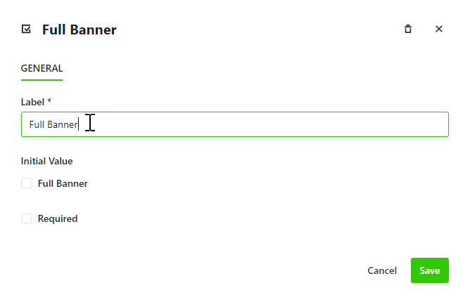
If you would like this value to be checked by default, check the box under Initial Value.
Click Save when complete.
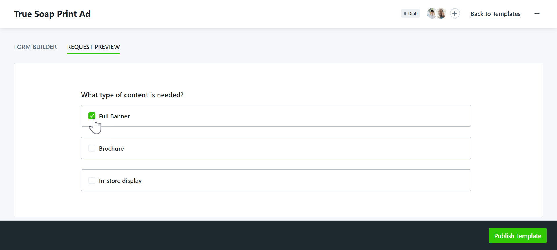
This is what your checkbox will look like to your requesters:
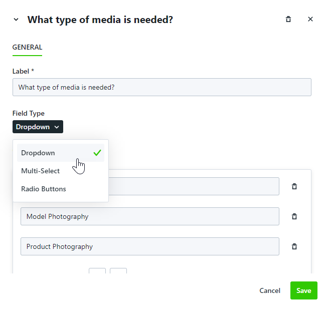
Dropdown, Multi-Select, & Radio Button Fields
While editing these fields is the same process, the outcome is different for each. Use the Dropdown field to provide your requesters with a list of options of which only one can be chosen. Use the Multi-Select field to allow your requesters to select multiple options. Use Radio Buttons to display options horizontally, of which only one can be chosen.
Click into the text box below Label to update the value that will be visible to your requester. Labels can also be edited from the design area.
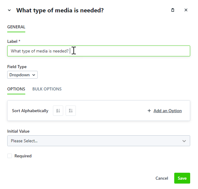
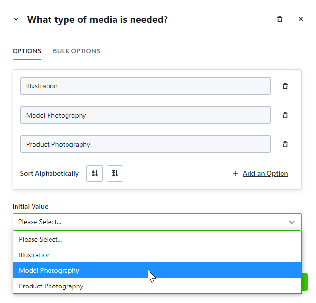
Add values for requesters by selecting Add an Option under OPTIONS.
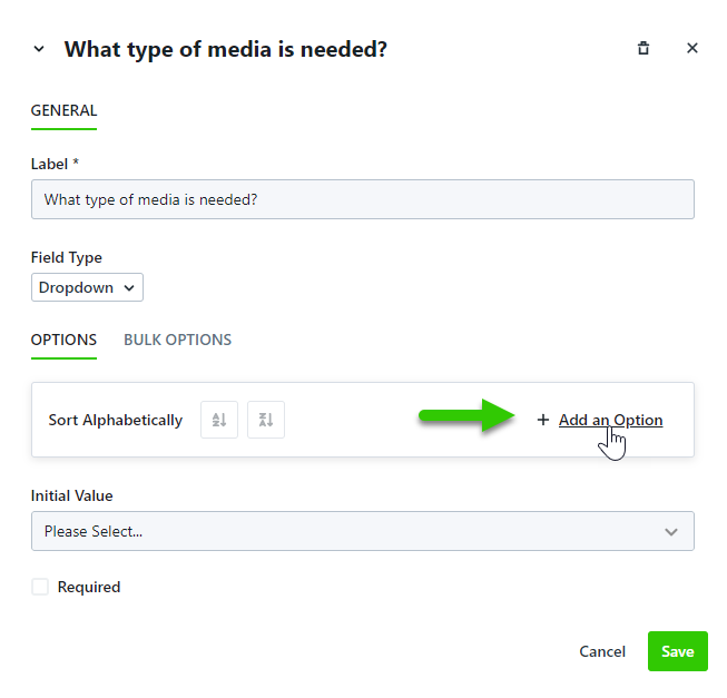
Add the name of the value into the text box and click anywhere outside of the field to save. Click Add an Option to continue adding values.
To bulk add or replace values select BULK OPTIONS.
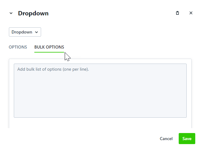
These can be added manually or copied and pasted from an existing document. Each row will become an option.
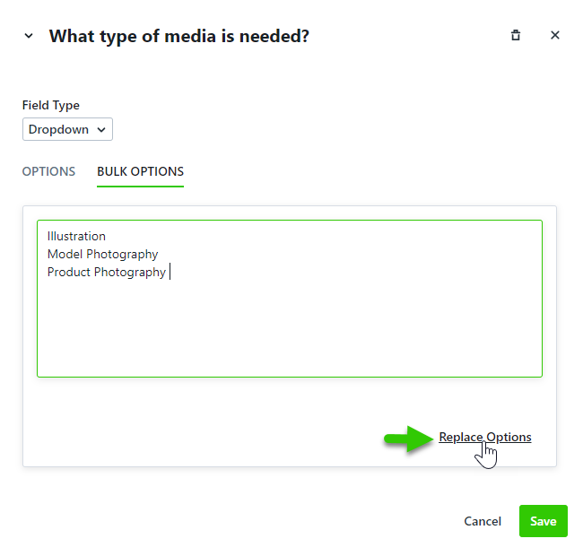
Click Replace Options when complete to populate these values.
From the Field Type menu, you can choose to convert your field to Dropdown, Multi-Select, or Radio Buttons.
To set a value to be selected initially, click the dropdown menu below Initial Value and select the value that should be selected by default. Requesters are able to select other values from the list.
Click Save when complete.
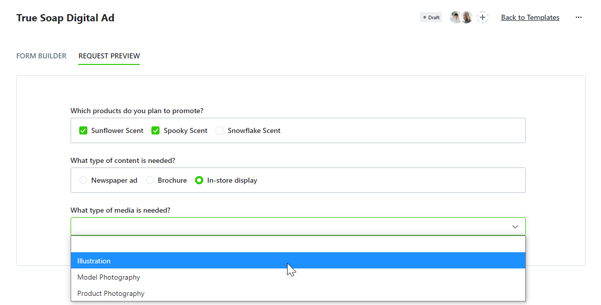
This is what your Multi-Select, Radio Button, and Dropdown fields will look like to your requesters:
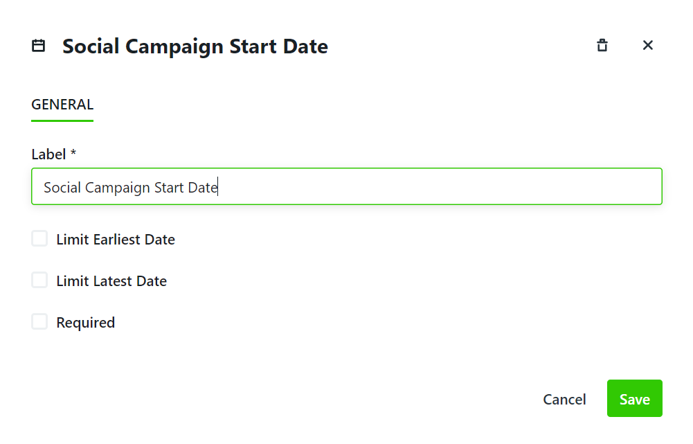
Date Field
The Date field allows requesters to select a date. Dates chosen from this field are referenceable but do not map over to the associated work. Due Date or a Date Custom Field* will map over.
Click into the text box below Label to update the value that will be visible to your requester. Labels can also be edited from the design area.
You can restrict the dates your requesters are able to select by checking Limit Earliest Date and/or Limit Latest Date. Click the plus and minus buttons to increase or decrease the number of business days needed.
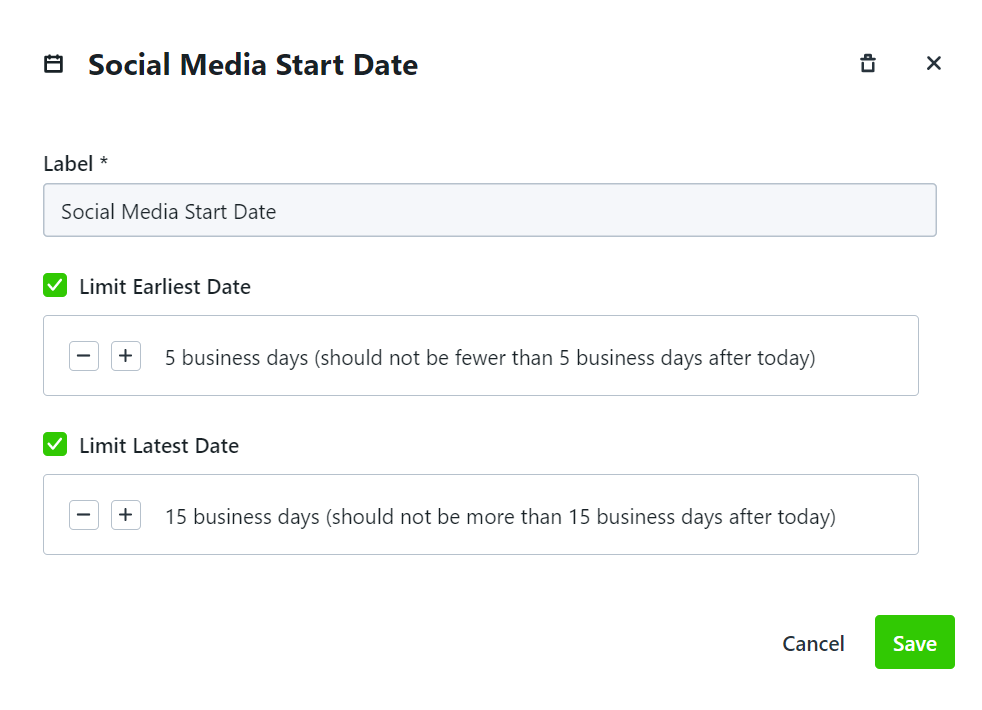 Click Save when complete.
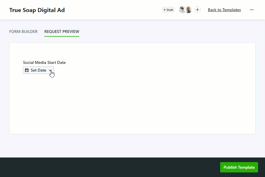
This is what your Date will look like to your requesters:
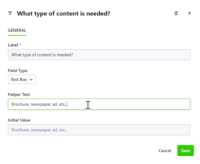
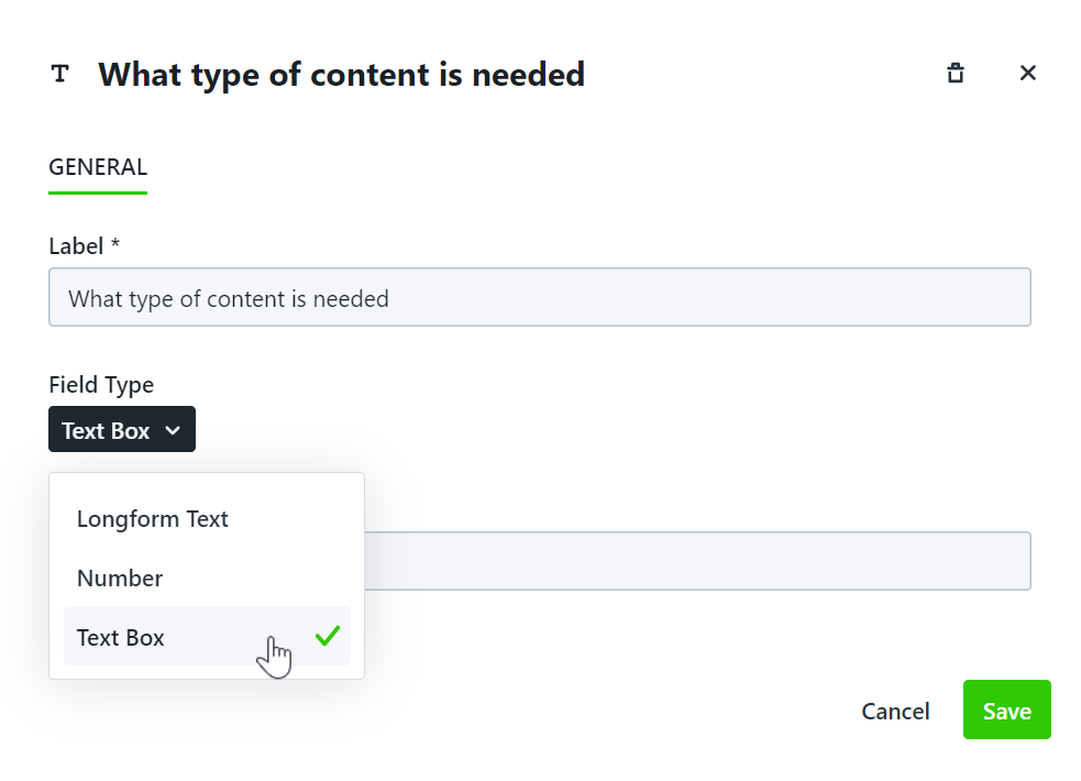
Text Box, Longform Text, & Number Fields
While the process for editing these fields is the same, the outcomes are different. The Text Box field is best used when your requesters need to provide short answers. The Longform Text field is best used when your requester may have a longer answer and/or require line breaks. The Number field will only allow your requester to answer numerically.
Click into the text box below Label to add a descriptor viewable to your requesters.
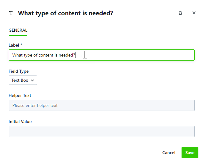
You can help guide your requesters' answers by providing information in the Helper Text. This will be set as the initial value and your requesters will be able to provide text and/or numbers over this value.
From the Field Type menu, you can choose to update your field to Text, Longform Text, or Number.
Click Save when complete.
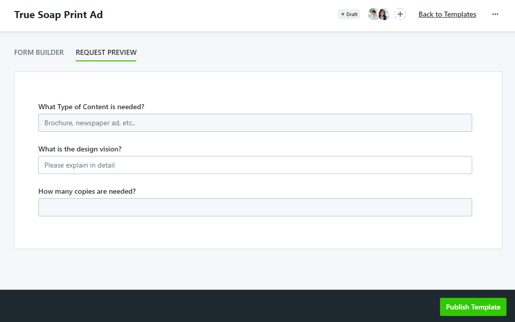
This is what your Text Box, Longform Text, and Number fields will look like to your requesters:
*Only available for Business and Enterprise customers